

Kana Whiskey Case Study
THE CHALLENGE
The challenge was to create a high-end liquid bottle that looked expensive and stood out from all other whiskeys.
TARGET AUDIENCE
The target audience for this project is adults from 21 to 65 years old, including young families and singles with disposable income and deep pockets. This whiskey is for anyone who enjoys the finer things in life.

RESEARCH & DISCOVERY
The challenging part of this project was creating a brand identity and design that stood out from over 510 whiskey brands in the world. I thought about my own experience and noticed that whiskey has historically been portrayed on television, in film, and advertisements as a man’s drink. It’s similar to beer and dark rum: the former is associated with men in pubs, the latter with pirates. But whiskey wins. It is the alpha drink for alpha males. Men drink whisky to celebrate, to forget, to look cool. Why, though, in an age when gender norms are being shredded, do we still conform?
This was when I realized that creating a whiskey that honors fierce femininity would be the best way to stand out from the crowd and, at the same time, honor my own feminine power.

COMPETITIVE ANALYSIS
Because the challenge was to design a high-end whiskey bottle, I set out to gather the top competitors of top shelf whiskies. Here is list of top competitors to name a few: Suntory, Johnnie Walker, Lagavulin, Laphroaig, Nikka, Spot, Glenlivet, Woodford Reserve, High West, and Redbreast.
Many of the whiskies out there had decent designs. They mostly used the colors maroon, dark green, gold, and beige. Many of the designs were text heavy or had fancy emblems. I discovered only a few whiskies that were made for women but none were readily available in most stores around the world. There is a growing market for whiskies made by and for women. In fact, women make up almost over 30 percent of whiskey drinkers in the U.S alone, and that number continues to grow.
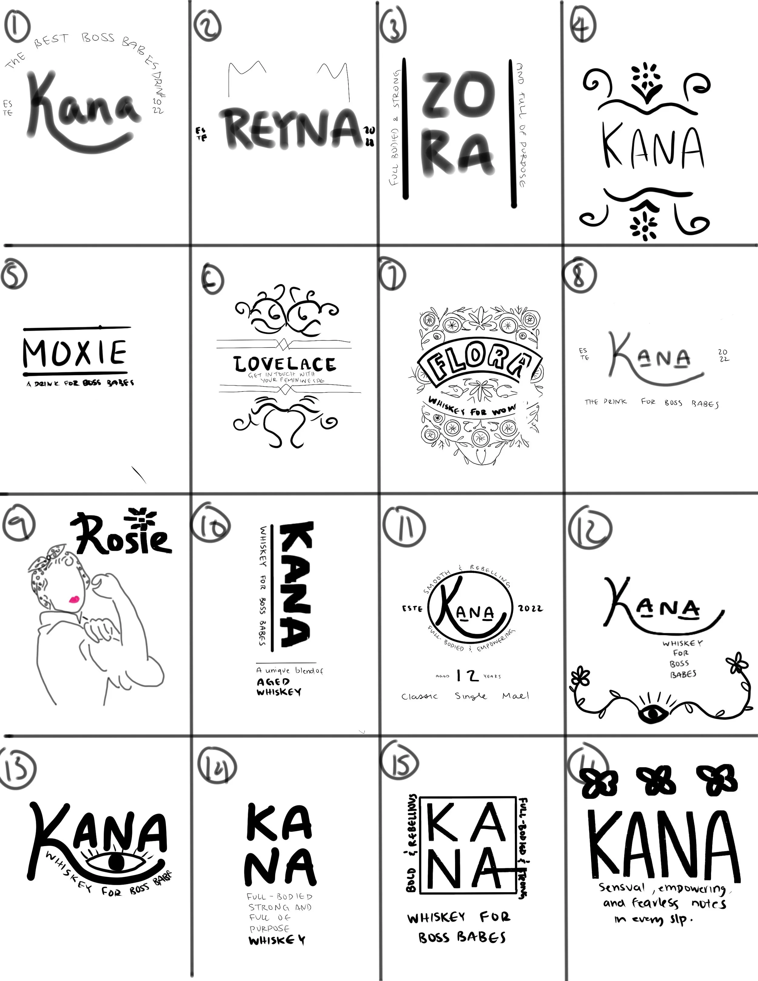
SKETCHES
With a word map, I played around with the idea of an empowered warrior woman. I thought about powerful women in history and names that might ignite the feeling and meaning of “power,” “warrior,” “goddess,” or “fierceness.” I explored various styles ranging from modern & simplistic to detailed & vintage. I also entertained the idea of including images representing power, empowerment, and fierceness while giving it a feminine touch with florals.
DIGITAL DRAFTS
For my first round of digital drafts, I wanted to explore a variety of different options. I explored the clean modern look, the hipster fun look, the elegant vintage look, the witchy look, the wordy look, and even thought about embossing the glass with a floral pattern. Each of these drafts had some good elements that I took with me to the next round.


DIGITAL DRAFTS ROUND 2
OPTION ONE
This design exudes elegance, sophistication, femininity, and high-end vibes. The information label at the bottom gave it a high-quality feel, and the vintage florals made the design stand out from what was already out there. Although this design is beautiful, I noticed it was missing the fierceness, powerfulness, and general badassery I wanted this whiskey bottle to represent.
OPTION TWO
This design is reminiscent of witchy goddess tarot cards, representing power, intuition, femininity, and inner strength. Although many of the design elements were strong, the label seemed to not fill the bottle right and it lacked the finesse that gave it a high-end feel.
OPTION THREE
The imagery of the tiger roaring was highly effective yet not too overpowering and overcomplicated. Simplifying it down to just the roaring tiger head was the right choice. However, because of the psychedelic-looking typeface, this design didn’t look cohesive with the brand.
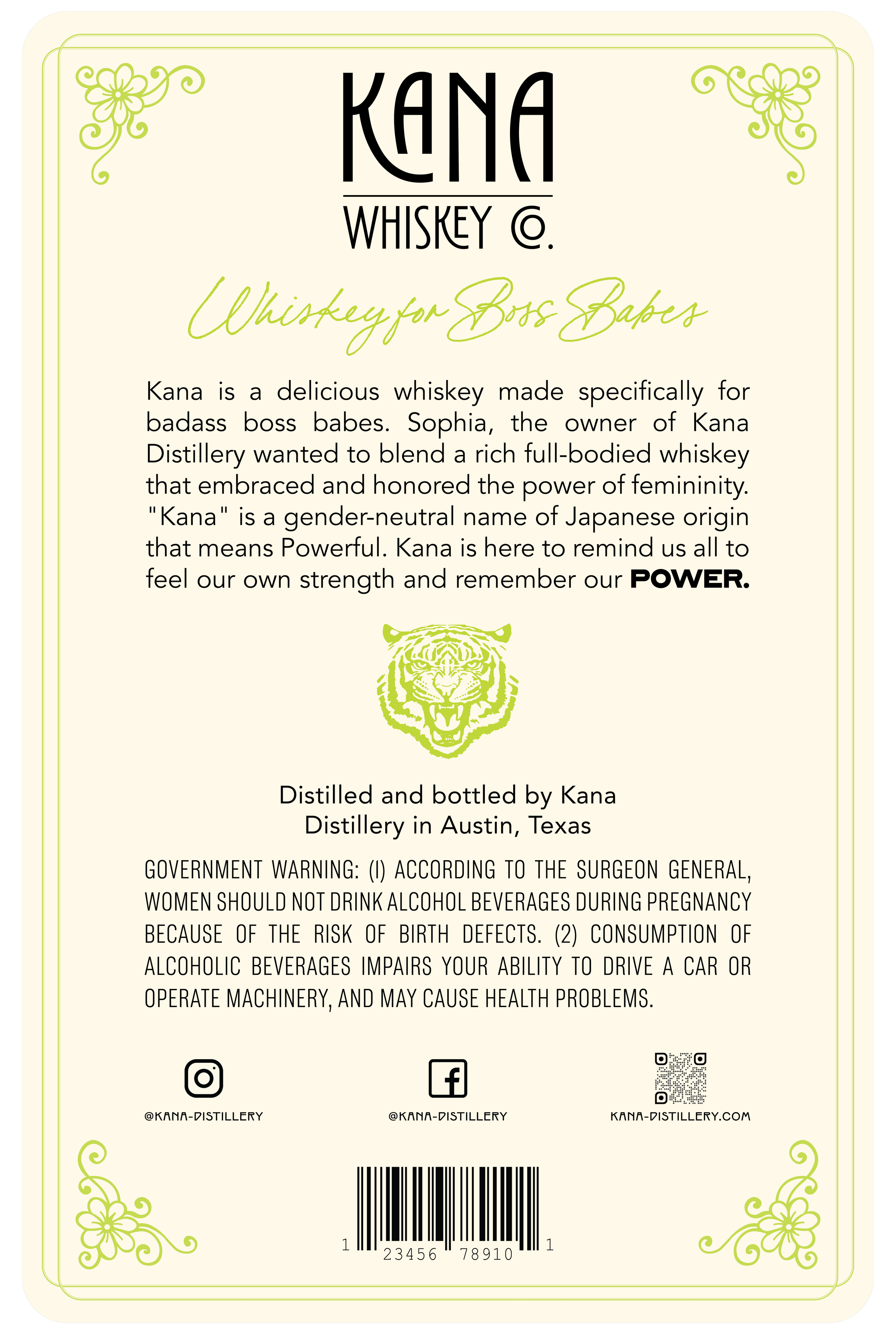
FINAL DESIGN


TYPOGRAPHY & COLOR
Display Typeface: Tropican Regular & Bold
Header 1: BN Norplay
Header 2: Bon Vivant
Body Typeface: Poppins Regular
REFLECTION
As a woman who drinks whiskey, I am incredibly proud of the elegant, fierce, sophisticated design and the message behind it. We can all get in touch with our feminine power whether we identify as a woman or not. Femininity is about the balance of softness and empathy with fierceness and strength, just like a glass of good whiskey. This whiskey bottle design stands out because of its unique target audience and design. This Kana whiskey design is still one of my favorite designs I’ve created so far!
This whiskey bottle design made the shortlist for the CA Typography Competition of 2022. As a result, ACC’s program specialist interviewed and featured me on ACC (Austin Community College)’s featured success story blog. Read my interview about this design here: ACC VisCom Featured Stories.